Your dashboard is a diagnostic tool, not a report card
Most candidates open their dashboard, glance at a number, feel good or bad about it, and close the tab. That's wasted data. Your dashboard exists to answer one question: where should I study next?
Every chart, every metric, every row in your history table is pointing you toward the gaps in your prep. Here's how to actually read it.

Stats cards: the numbers at the top
Three cards sit at the top of your dashboard. Each one tells you something different — and each one requires a different reaction.
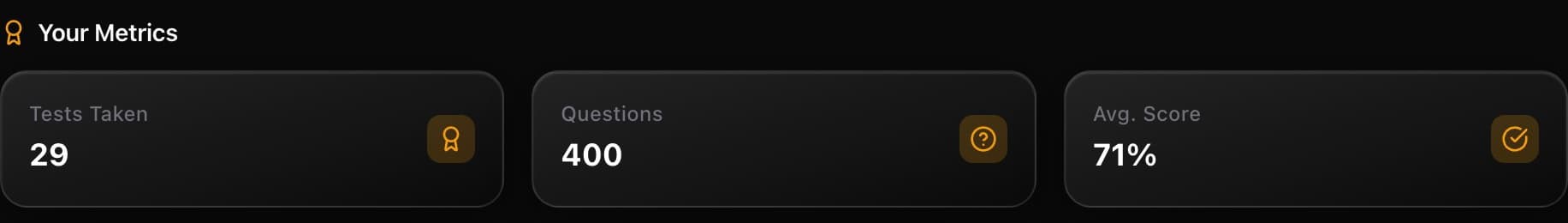
Tests Taken (29) — This is your volume count. Practice quizzes and mock exams combined. Volume matters because analytics become reliable only after enough data. If this number is under 10, your charts are noise. If it's above 20, you've got enough signal to trust the patterns.
Action: If you're under 10 tests, stop analysing and start practising. Get the reps in first.
Questions (400) — Total questions answered across all attempts. This is the real measure of how much ground you've covered. With 400 questions, you've seen a meaningful sample of the CIRE question bank. But the exam draws from hundreds more. Keep pushing this number up.
Action: Use this to gut-check your coverage. If you've done 400 questions but only across 3 elements, you've got blind spots.
Avg. Score (71%) — Your running average across every attempt. This is the number most candidates fixate on. Don't.
Your average is a lagging indicator
Early low scores drag the average down long after you've improved. A candidate who scored 50% on their first 5 quizzes and 85% on their last 10 will still show a 73% average. The average tells you where you've been, not where you are. Look at the Score Trend instead.
Action: Check your average once a week, max. If it's climbing, good. If it's stuck, the analytics tabs will tell you why.
Score Trend: the chart that actually matters
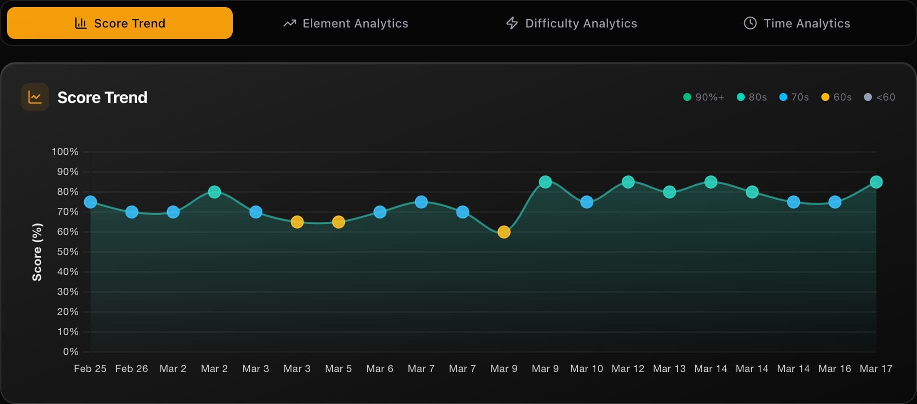
The Score Trend tab is selected by default, and for good reason — it's the single most useful view on your dashboard.
Every dot is a quiz. The dots are colour-coded by score tier:
- Green — 90%+ (you own this material)
- Teal — 80s (solid, minor gaps)
- Blue — 70s (decent, but room to improve)
- Amber — 60s (shaky — needs targeted work)
- Grey — Below 60 (flag this element for serious review)
Hover any dot to see the quiz name, your score, and the date you took it.
But individual dots aren't the point. You're reading the trend line — the curve that smooths out the noise and shows your trajectory.
Rising trend — You're improving. Whatever study approach you're using, it's working. Don't change anything. Keep the same mix of elements and difficulty.
Flat trend — You've plateaued. This is the most common shape after 15-20 quizzes, and it means you've picked the low-hanging fruit. Time to shake things up: increase difficulty, target your weakest elements with custom mocks, or use the AI tutor to break through concepts you keep getting wrong.
Dipping trend — Don't panic. Dips almost always mean you tried harder content or a new element. That's exactly what you should be doing. A temporary dip followed by recovery is the signature of someone who's actually learning, not just repeating what they already know.
The 10-quiz rule
Do not draw conclusions from fewer than 10 quizzes. A single hard quiz on Derivatives can make your trend look like it's cratering when you're actually fine. The trend needs data to mean anything. Take at least 10 quizzes before you start reading the shape.
Action: After every study session, open Score Trend and check your trajectory. Rising? Stay the course. Flat for more than a week? Switch to the analytics tabs to find what's holding you back.
Analytics tabs: where to focus next
Below the Score Trend, three more tabs dig into the specifics of your performance:
| Tab | The question it answers |
|---|---|
| Element Analytics | Which of the 8 CIRE elements are strong? Which are dragging you down? |
| Difficulty Analytics | Are you coasting on easy questions or actually handling medium and hard? |
| Time Analytics | Are you rushing and making careless mistakes, or overthinking and running out of time? |
Each of these tabs has its own charts — treemaps, radar charts, box plots, scatter quadrants — and each one deserves a proper walkthrough. That's covered in the Analytics Deep Dive.
Action: Don't skip these tabs. The Score Trend tells you that something is off. The analytics tabs tell you what is off. That's the difference between "I need to study more" and "I need to spend 30 minutes on Market Integrity & Trading Rules tonight."
Quiz History: your complete record
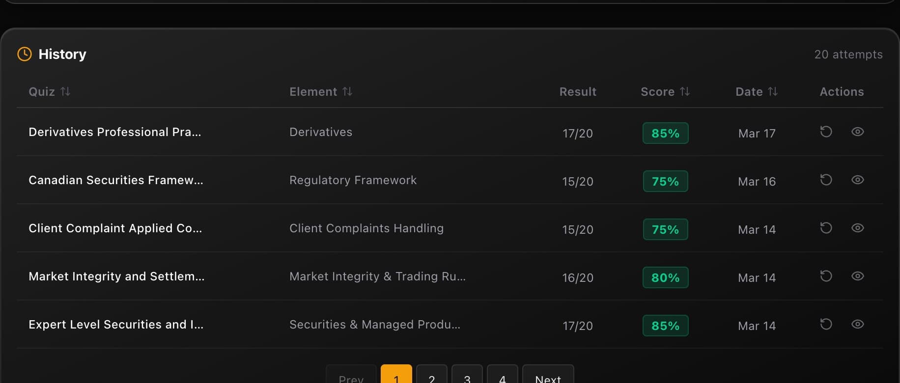
At the bottom of every dashboard view, the History table shows every quiz you've taken — 20 attempts across sortable columns for Quiz name, Element, Result, Score, and Date.
Click any column header to sort. Want to find your lowest scores? Sort by Score ascending. Want to see what you did last week? Sort by Date. The table paginates, so scroll through to find specific attempts.
Every row has two actions:
Reattempt — Take the exact same quiz again. This is more powerful than it sounds. A reattempt gives you a direct before/after comparison on identical questions. If you scored 60% two weeks ago and 85% today, that's not the average telling you something — that's proof you learned the material. Reattempts also expose whether you actually understood the concept or just memorised the answer. If you get a question right on review but wrong on reattempt, you hadn't really learned it.
Review — Go back through your answers, see explanations for every option, and understand exactly where you went wrong. This is where the real learning happens — not in taking the quiz, but in understanding why the wrong answers are wrong.
The reattempt test
Pick your worst quiz from two weeks ago and reattempt it. If your score jumps, your study approach is working. If it doesn't, you're reviewing without retaining — change how you study, not how much.
The dashboard habit
Daily: take a quiz and check the trend
Open the dashboard, take a practice quiz or your daily challenge, then check Score Trend. One glance at the trend line tells you if today moved the needle. Consistency compounds — 10 questions a day beats 100 questions once a week.
Weekly: review your weakest results
Sort your History table by score, ascending. Pick 2-3 quizzes where you scored below 70% and review them. Don't reattempt yet — just read the explanations and make sure you understand why each answer is correct. Flag any concepts that still don't click for an AI tutor session.
Bi-weekly: dig into the analytics tabs
Every two weeks, spend 10 minutes in Element Analytics and Difficulty Analytics. Find the elements where your radar chart dips lowest. Build a custom mock targeting those elements at medium difficulty. Then reattempt your worst quizzes from two weeks ago to measure real improvement.
Your dashboard is doing the analysis for you. The stats cards tell you how much work you've put in. The Score Trend tells you whether it's paying off. The analytics tabs tell you where to aim next. And the History table lets you prove to yourself that you're getting better. Use all four, and you'll never waste a study session again.